Showing posts with label Illusion. Show all posts

Friday, 31 January 2014

M Is For Merging Media


Tomorrow, Saturday February 1st 2014, the University of Kent will host the one-day conference Merging Media, an interdisciplinary approach to hybridity in the arts. Looking at the overlap and convergence between different art-forms – such as live performances that utilise filmic projection, music composed to accompany paintings, the intertwining of written word and images on the page, and so on – the conference was co-organised by Keeley Saunders, Frances Kamm, Emre Caglayan, and myself. ( http://blogs.kent.ac.uk/mergingmedia/ ) To mark the event this post will explore one such phenomenon of artistic hybridity in M Is For Man, Music And Mozart, a film directed by Peter Greenaway, and its relationship to the tradition of illuminated texts. This is in some part intended as a response to the surprising lack of papers on the filmmaker, well known for his explorations of the limitations of the cinematic medium and its relationship to other art-forms.


Greenaway has been vocal on the subject of cinema’s limitations for many years, most overtly in his insistence that cinema has never developed into its own visual medium, and that it’s reliance upon the written word (in the form of screenplays) makes it a slave to the earlier traditions of literature and the theatre. He believes that cinema, in order to free itself from the constraints of text, should become an entirely audiovisual medium, closer to a moving painting than a performed story. Despite this attitude, Greenaway himself has produced little work in this vein, instead choosing to produce work that critiques existing cinematic conventions rather than providing alternative ones.


Not to say that he has produced nothing that moves beyond the parameters of standard film; there is the multi-screen VJ performances of The Tulse Luper Suitcases, where he edits the film ‘live’ on stage, or the installation work Peopling The Palaces, that projects film on to all of the walls and even ceiling of a particular venue, providing an immersive cinematic experience, or his projection of light onto Rembrandt’s The Night Watch in order to make the painting appear to move and transform. But his most well known works (The Cook, The Thief, His Wife & Her Lover, The Pillow Book, Drowning By Numbers or Nightwatching) are feature-length narrative films that began life as screenplays. These films often provide alternative ways of presenting story information other than through traditional narrative; Drowning By Numbers is structured numerically, with the numbers 1-100 littered through the film counting down to the conclusion, Cook/Thief/Wife/Lover structures its characters and events around the conceit of Newtonian colour theory, with each set designed around a different colour and its apparent associated meanings. But most frequently, Greenaway’s favourite alternative structure to narrative is that of lists and categories.


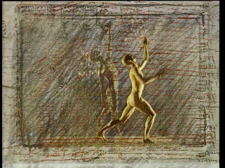
M Is For Man, Music And Mozart is a 30 minute short film (part of the series Not Mozart where famous directors and composers deconstruct the works of Mozart) that demonstrates Greenaway’s obsession with the cinematic image, its relationship to text and theatre, its potential to replicate painting and become a chapter in the history of Visual Arts, and the use of categories, lists and associations as alternative devices to narrative. Ostensibly, the film is a meditation on Mozart and his music through a series of short segments, each building upon the last and providing a slightly different structuring device. It opens with a list of words, written and sung in largely alphabetical order, presenting a variety of concepts related to man, his body (B is for bile, blood and bones) and beliefs (A is for Adam, E is for Eve). As these words appear across the screen, two female dancers (who might be muses, fates, furies, or stage-hands) communicate the ideas through their bodily movements in a blacked-out space, filled in by sketches and words superimposed on screen.


Once the alphabet has reached the middle letter, ‘M’, an allegorical tale begins, showing the gods creating man. The gods, a shifty looking crowd of corpse-white individuals wearing rags and holding various signs marked with single words, proceed to try and make a ‘man’, going through various possible source materials. Now the film utilises a ‘theme and variation’ structure: a Man of Letters is a human outline created from the gods’ signs, a Man of Meat is cobbled together from a butcher’s wares, a Man of Metal is comprised of various utensils, and so on. These proto-men are Acrimbaldo-like figures, simultaneously a human-like entity and a collection of objects.


Eventually, Man as we know him is finished and a new sequence begins where the gods teach man movement. An extended dance sequence functions as a demonstration, as Man slowly at first moves his arms and legs, eventually getting up and dancing about the auditorium where the action takes place. In the next sequence, the gods teach Man music, and another dance sequence sees the two maybe-muses manipulate Man like a mannequin, moving him in rhythmic actions and placing various instruments in his hands. Finally, having created man and music, the gods find it necessary to create Mozart and another sequence mirroring the first sees Man in a blacked-out space embellished with hand-drawn sketches and notes.


Throughout all of these sequences, words and letters dominate the screen. Laid over the images, superimposed or held by figures within the frame, the text threatens to overcrowd the visuals with their numerous meanings and implications. William Van Wert has written an intriguing analysis of the multitude of meanings inherent in the words and images of the film on the Senses Of Cinema site ( http://sensesofcinema.com/2001/cteq/man/ ). Greenaway’s common complaint – that film is slave to the text rather than free to be an entirely visual medium – would appear to be quite explicitly at work here.


But Greenaway twists this relationship in order to give visuals the upper-hand. Long fascinated with calligraphy, the art of penmanship where the craft is in the very specific visual flourishes of letters, Greenaway transforms text into images, the words do not overcrowd or block out the visual composition, but instead become a part of it. Though there remain layers and layers of complex word-games and associations going on within the words on screen, our attention instead is pulled towards the visual qualities of the words, their aesthetic worth within the overall framed composition.


M is not only the first letter in Mozart’s name, it is also a symmetrical letter, sitting in the centre of the frame (as it sits in the centre of the alphabet), it calls attention to and aids the balance of the composition, further emphasised through the similarity of the two muses/stage-hands that cavort throughout the film. Likewise, the scroll of writing that runs along the top of the screen, like a news report, simply reiterates words that have been sung earlier. These words are included because of how they look and what they add to the film’s visuals rather than as communication of new information.


As stated above, we can find these sorts of text-image relationships in an earlier tradition, that of the illuminated manuscript. One can find a plethora of illuminated books from the 13th century onwards that augment the written words of the Bible with ornate images that do more that simply illustrate the story, but I wish to focus on two much later examples. William Blake, famous for providing illustrations to the Bible, Milton’s Paradise Lost, and Dante’s Divine Comedy, produced his own Illuminated Books that utilised the same principal of the classical illuminated texts, intertwining text and image on the page so that the two become united both in textual meaning and aesthetic composition. But these works did not celebrate Christianity as much as they propagated his own personal spiritual mythology that denounced the oppressive nature of orthodox religion. The mythic tales not only blur distinctions between art and literature but also fascinatingly present complex spiritual concepts that blur people with places, humans with the cosmic.


Linking in with the previous month’s post on Wunderkammer’s, the illuminated work The Model Book Of Calligraphy belonged to the eccentric Emperor Rudolph II. Initially a book consisting entirely of calligraphy by Georg Bocksay, Rudolph II commissioned artist Joris Hoefnagel to provide paintings to accentuate the visual beauty of the words. Hoefnagel not only provided images that related to the words already on the page but also composed them in such a way as to create apparent spatial relationships between word and image. The text, originally laying flat on the page, now seems to float in the air, hovering above the flora and fauna that appear grounded on an ambiguous surface. New images, depicting specific objects, transform the nature of the images of text. Not simply illustration, where the images are limited to the content and meaning of the words, but a visual response to the text, Hoefnagel’s illuminations prefigure Greenaway in their combination of text and image in service of aesthetic rather than informative purposes. These images have been taken from three volumes published Thames & Hudson, annotated by Lee Hendrix and Thea Vignau-Wilberg. Unfortunately, there are few images available online and so these are photos of the books taken by my own fair hand – hence the slightly poor quality.


The latter portion of the same book allows Hoefnagel to take this even further, producing an ‘Abecedarium’, an artistic guide to the letters of the alphabet. Here, the letters form the central focus of each image, but they are also the foundation of a visual work, it is their artistic qualities that are emphasised. Both the ‘majuscules’ (capitals) and ‘miniscules’ (lower-case) are presented to us in glorious elaboration, the symmetrical composition and rich detail of the depicted objects again creating a sense that we are seeing a three-dimensional construct in space rather than a flat image on a page.


This is the same effect that Greenaway achieves, though through the exact opposite means. While Hoefnagel takes the flattened words and letters of text and places them within a fictional space through the application of artistic depictions, Greenaway takes the actual space of the pro-filmic action – the auditorium and space where the figures move, create and dance – and uses overlaid text to flatten the images on screen. The images and text are united in a conceptual middle-ground; in Hoefnagel’s work, they do not meet on the page but the space depicted within it, and in Greenaway’s film the diegetic space of the action seems to collapse into the non-diegetic superimposed text to create a composition that exists on the screen.  In both cases different artistic media have been merged in the creation of something new.

                                                                                                                                     - P.S.

Monday, 28 October 2013

Depiction And Fiction

I find animated imagery fascinating. It is not simply the characters, stories, visual compositions or stylistic tropes that draw me to animation; there is something in the fundamental nature of the animated image as a depiction that – for me at least – opens up a variety of possible interpretations, or readings of the image, in otherwise fairly straightforward narrative moments. I have briefly mentioned in a previous post the idea of ‘depiction and fiction’, the multitude of interpretative layers that are introduced by the relationship between the animated imagery and the fictional worlds and objects that the imagery creates for us. These thoughts are really just an indulgence in this fascination, rather than an argument about medium specificity or the superiority of such images over more standard ones.

What does the phrase ‘depiction and fiction’ refer to? Put simply, when we look at a recorded image of something (whether recorded photographically or digitally) we see a trace of the original object, but when we look at a rendered depiction of something – that is, an image that has been created through a combination of shape and colour to resemble something that we can identify – then this image has a dual status. The image we see is both a depiction and the thing being depicted. We have the option of either looking at the image (seeing Simba from The Lion King as a drawing) or looking through it (seeing Simba as a diegetic lion). Although the notion of ‘trace’ and the apparently unmediated nature of the live-action recoded image is, quite rightly, viewed with some suspicion by many scholars, my focus here is predominantly with the created imagery of traditional animation and thus I will just be conceptualising the live-action image as a recorded trace for the sake of ease. If one wishes to argue that a live-action image is also doubled (both ‘Cary Grant’ and a ‘flat projection of a recording of Cary Grant’ simultaneously) then all this means is that the animated image becomes equivalently trebled (the character ‘Simba’, the ‘hand-drawn depiction of Simba’, and the ‘projection of the recorded image of the drawing of Simba’). For simplicity, I shall therefore continue to consider the live-action image more ‘transparent’ than the animated one.

I intend to return to this idea of depiction and fiction in future posts, exploring the implications that it has for narrative comprehension, diegetic integrity and the ‘truth’ of the animated image. But for now, to lay the groundwork, I shall briefly demonstrate what I mean when I talk about multi-layered nature of the animated image when considering the relationship between the depiction and the fiction that it depicts. Let us consider the following image:


Here we have a fairly straightforward image from a Hollywood Golden Age short – The Toonerville Trolley from 1936 by Van Beuren Studios. We can see the image in one of two ways – as a flat depiction or as the diegetic space, objects and characters that have been depicted. Our understanding and acceptance of animation is so ingrained in our civilisation that we do not look at the image and struggle to comprehend it. We can happily make out a countryside environment, a train track, a trolley running along the track (though our understanding of the trolley might be dependent on our historical knowledge of the almost totally defunct form of transportation), and the Skipper riding the trolley. The degree of caricature, of simplification and exaggeration, contained in the image does not confuse us. Although we have never encountered a man who looks exactly like the Skipper in our real lives (with those exact proportions or textures), we have a good enough grasp of animation convention to successfully look through the depiction and see a man driving a trolley along a track in the countryside. Yet simultaneously, we are also able to see nothing but the caricature, looking at the image and its overt differences from what we understand it to be depicting.


This next image is, of course, a photographic record of a toy. But let us for the moment ignore the photograph and focus on the toy itself. The toy, as a hand-made object designed to convey an impression of something rather than being the thing itself, is also mode of depiction. But here the levels of fiction contained within the depiction have increased. It is on one level a toy and we can appreciate it as a three-dimensional object. At the same time we can look through the toy and see the same trolley and Skipper within. But there is another layer of fiction in-between these two, which is the possibility of looking through the depiction of the toy and seeing the animated image. The object can therefore be the diegetic trolley and driver, the animated depiction of the trolley and driver, and the hand-made toy of the animated depiction of the trolley and driver. As an object, it has a three-fold existence depending on how we choose to appreciate it, what we choose to see (and therefore the actual photograph of the toy that you’re looking at now has a four-fold existence). Just the toy itself, as both an object and a double-depiction, has enough visual complexity to keep me happy for hours, even though it appears to be a fairly unremarkable object.


But we are not done yet. This next image is from Labyrinth Labyrinthos, a segment directed by Rintaro from the 1987 anthology film Neo Tokyo. In this array of tin toys that are suddenly brought to life we can make out some generic tin toys (the tortoise), some thinly-veiled analogues (the not-quite-Mickey Mouse) and, in the centre of the shot, the Toonerville Trolley toy. As one can predict, we now have further layers of appreciation and understanding at work in this image. It is a hand-drawn animated depiction and we can appreciate it on this level. We can look at the detail of it, the ways in which light and shadow are used to create a greater sense of depth and texture than we find in the first image. Although a single image doesn’t allow us to, we can also conceivably appreciate the movement of the depiction as it makes its way across the screen. But we can also appreciate it as a toy, looking at both its form and movement in the same way that we would the actual tin object. And because of the ‘actual’ nature of the toy (it refers to a real toy in our world that we could possess) it also contains the layer of fiction of the original animated image. It is a drawing of a toy of a drawing of a diegetic trolley; a depiction, of a depiction, of a depiction of a thing. Although on-screen for all of five seconds, the Toonerville Trolley toy in Labyrinth Labyrinthos serves as a reminder of the inherent complexities of the hand-drawn imagery of animation. The multiple layers of possible interpretation are unavoidable.

The simultaneity of the animated image, that it is one, or two, or three, or more things all at once, is one of the principal fascinations of animation (and the visual arts) for me as an individual. Just as with Satoshi Kon’s use of depiction and fiction to play elaborate visual games with flat surfaces and depicted spaces, all animated characters, objects and environments are able to contain multiple diegetic layers, each one potentially a web of meta-fictional references.

                                                                                                             - P.S.

Saturday, 24 August 2013

Surfaces And Spaces: In Commemoration Of Satoshi Kon

Today marks the third anniversary of the death of director Satoshi Kon on what would have been his 50th year. In honour of this fact, this post will briefly discuss the tragedy of his death, and the ways in which Kon as a director explored the animated medium in both ingenious and multifaceted ways.

Kon’s death was tragic on many levels; dying at such a young age would be awful enough, irrelevant of his artistic abilities, but the fact that he was never able to reach his full potential as a filmmaker is perhaps more tragic to the world at large. I fully believe that had he lived he would have become one of the most significant figures in animation. The word ‘genius’ tends to be excessively used these days, but I honestly believe that, if Kon wasn’t a genius, then he certainly would have developed into one. His films often explored the conventions and philosophies of live-action film but did so through a unique approach to animation. He made films that on first glance were essentially ‘live-action films that were drawn’, replicating real life filming techniques, treating characters as if they were solid actors existing in a real pro-filmic space. Yet just below the surface, it was apparent that Kon was really exploring the possibilities of the animated image; replicating live-action only helped to emphasise just how utterly different the animated film is to the live-action one. But these films were not simply academic exercises in the possibilities of animation to explore perception – they remained engaging character-driven narratives, rarely slipping into the realms of artistic self-indulgence. Both Tokyo Godfathers and Millennium Actress are heartfelt stories about characters dealing in different ways with their past actions. The focus on both of these films is the emotional landscape of the characters, their relationships and their memories. But this exploration utilises the animated form completely, doubling and fracturing the characters in order to explore their identities. Past, present, dream, reality, individual personality and collective unconscious all become undifferentiated in Kon’s stories, which are always more complex than they appear on first viewing.

Another tragedy of Kon’s death is that his final film, The Dreaming Machines, will probably remain unfinished. Though animation studio Madhouse announced their intentions to continue production after his death, the film seems to have fallen by the wayside, a victim of financial and creative issues. But most tragically of all, for me at least, is the fact that Kon seems destined to be remembered for his two weakest films. When news of his death first broke, the comments left up on websites message boards over the internet reiterated more or less the same general sentiment: ‘I wasn’t really fond of Perfect Blue or Paprika but he clearly had the talent to grow as an artist’. I don’t wish to paint either of these films as ‘weak’ in any objective sense, as I think that they’re both very good in that they achieve by and large precisely what they set out to achieve (indeed, each time I watch Perfect Blue I’m struck by just how well directed it is – the film’s biggest flaw is its ending… but that critique will have to wait for another post). But neither one is as complex or rewarding as Tokyo Godfathers, Millennium Actress or the best episodes of the television series Paranoia Agent. Although there is a tendency among the ‘experts’ to place more emphasis on these less well-known films (several academic books and journals have analysed Millennium Actress as Kon’s ‘magnum opus’ because… well, it is), the general public will probably always remember him for his two most obviously ‘genre’ films. If, after his death, Hayao Miyazaki were to end up being remembered for Kiki’s Delivery Service – perfectly good film though it is – we would think that his memory was being severely sold short. The same is the case with Kon.

But to demonstrate that I do still think his brilliance is at work even in these two more ‘obvious’ films, I will now present a very brief analysis of the complexities of image that are apparent in the opening credit sequence of Paprika, his final finished film. Much like any Kon film, on the surface the animation appears to be a straightforward replication of live-action filmmaking aesthetics. The opening five-minute sequence has two characters traverse through a variety of overtly cinematic scenarios – homages to spy movies, screwball comedies and Tarzan all bleed into one another – playing like a love-letter to classic era Hollywood. But as the opening credit sequence itself begins, we can see Kon’s more significant concern – the possibilities of the animated image in comparison to the live-action one – come to the fore. In a live-action film, we see a real three-dimensional space that has been recorded and projected on to a flat surface. But with the hand-drawn animated film, we see a depiction of space – a flat surface that only gives the impression of depth. This fundamental difference between the two is Kon’s central conceit throughout the sequence.


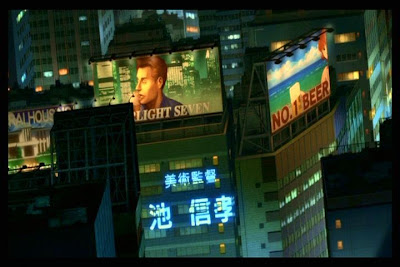
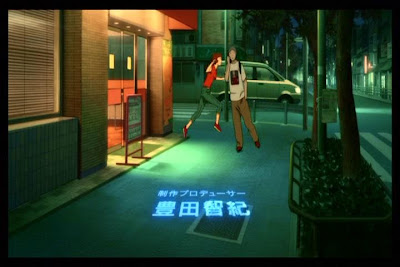
To begin, there is an immediately blurring between the diegetic space of the fictional world and the extra-diegetic information of the credits. Placing the credits within the story-world is an idea that Kon uses in Tokyo Godfathers and each of the episodes of Paranoia Agent, and here the names of the various people involved in the production of the film are ‘projected’ into the world of that film. This gives the impression that the surface of the image is actually a space through which this light can traverse and contains solid objects that this projected light can hit. As can be seen in the images above, the words are themselves presented as if they are warped by uneven surfaces, emphasising the impression of space and depth within the surface of the image. This is of course an illusion, as the faces, vehicles and buildings are all themselves flat depictions and the projected words are equally flat. But the combination of the two draws attention to this illusory nature of the animated image.


When Paprika, the titular character riding the scooter, passes in front of a painted image on the side of a truck, she suddenly becomes that image, which comes to life and she blasts off of the surface into the space above the cityscape. Again, what we have in reality is one single flat surface, carefully crafted to create the impression of different layers of spaces and surfaces. This in itself is common enough in animated films. But it is Paprika’s own movement across these layers that highlights their multifaceted nature. The image on the truck is not simply a depiction on a flat surface, but a flat depiction of a three-dimensional space containing a flat surface which depicts a rocket which takes off into another flat surface depicting a three-dimensional space.


Immediately following this we are presented another movement that creates complex relationships between depicted surfaces and spaces. Paprika appears as a character on a billboard on top of a skyscraper. She is depicted standing behind a man but then decides to get up and move in to the adjoining billboard advertising beer on a beach. She moves into the new space, turns, reaches and picks up the glass and moves off out of sight. The fact that the shot is composed in the way that it is, looking down from a high angle, and the fact that the two buildings are not aligned emphasises the games of spatial perception that Kon is playing. We have a flat surface depicting a space containing two buildings, the angle of which creates an even greater sense of depth. But on top of each building are flat surfaces which depict two other spaces. By moving across, Paprika unites the two disparate flat depictions into a new continuous three-dimensional space. The billboards become windows through which we can look into this illusory-space-within-illusory-space (mirroring the way in which the cinema screen appears to be a window into a fully-realised diegetic world).


In the next sequence, Paprika moves from the surface of a computer screen in to the room containing the computer. The movement is on one level a simple shift from flat surface to three-dimensional space, but it also, like the billboards, creates a new space out of a surface. She is behind the screen, but at the same time she is in front of the information being displayed on the screen, creating a gulf between the two layers wherein she can exist. More importantly, because of the smooth continuity of her movement, the office space behind the partition from which she emerges becomes collapsed into this virtual space. Initially we have a single surface depicting an office space, within which there are other flat surfaces, the partition and in front of that the computer screen. But Paprika’s brief movement transforms the image into a depiction of a virtual space containing a virtual layer. The flat surfaces of the computer screen and partition become a single layer in front of Paprika, while the visual information on the computer and the office become an expansive space behind her. In live-action, where the space would be real and not depicted and a surface could not be a space simultaneously, such visual complexity would be difficult, if not impossible, to pull off.


Next, Paprika emphasises the three-dimensional space by de-emphasising herself as a flat surface. Like the film’s credits, she is projected into the world from somewhere else. As she skips down the hallway, unseen by the security guard walking in the opposite direction, we can see that she is not a solid object within that depicted space, but rather a flat projection that warps as it moves along the different surfaces of the hallway. She is not a flat image moving across a surface (as she is on the side of the truck), or a solid figure moving through a surface depiction as if it were space (as she does on the billboards), she is a flat image moving through a three-dimensional space. Or, at least, she is if we view the hallway as a space rather than a surface depiction of space. Paprika’s own flatness and the fact that she seems to move through the hallway-as-a-space rather than over the hallway-as-a-depiction emphasises multitude of possible ways of reading the animated image. At the very end of the shot, she is momentarily projected over the guard, at once emphasising his solidity and existence within a space but also reminding us of the flatness of the surface image.


Toward the end of the credits sequence, Paprika escapes from the unwanted amorous attention of a couple of young men by jumping behind another man on rollerskates. The man skates towards the camera and we see Paprika is now an image on his shirt. As he rides into the camera, the depicted space on his shirt becomes a three-dimensional space for Paprika. Or, more accurately, the surface that depicts the space of the street contains within it the depicted surface of the shirt image which then becomes a surface depicting a new space(!). Like the computer screen in the office earlier, the space surrounding the surface of the shirt and the space depicted on the surface of the shirt become collapsed into a single continuous space for Paprika. But while in the office sequence the computer screen could almost be seen as a window allowing us to see through the partition into the space behind, here the notion of ‘in front’ and ‘behind’ are rendered void. If we view the surface of the shirt as a window through which we can see the space beyond, this means that the space Paprika is in is behind the space of the street. The image on the shirt therefore would be not only a window through the surface of the shirt but also through the space of the street. So, if she starts out in the space of the street and jumps behind the man, how could Paprika end up behind the street? We are, of course, not meant to think these sorts of questions of spatial continuity as we watch – but I would like to think that this interrogation of the animated image, as a depiction of space rather than as actual space, is more than simply over-thinking on my part. These kinds of visual games are at play in numerous animated films. Just think of Wile E. Coyote painting a tunnel on to a brick wall, only for the Roadrunner to run into the depicted tunnel, transforming the surface into a space.

At the very last moment before the man on skates runs into the screen, Paprika jumps to get from one image (on the shirt) to the next (in the street). Her arms extend beyond the frame of the shirt’s image, making it look as if she has jumped out of the shirt. In fact, she has jumped from the depicted street on the surface of the shirt into the space of the street depicted on the surface image of the film. For Paprika as a character, much like the Roadrunner, the distinction between surface depiction and depicted space becomes redundant. She behaves as if she knows that space is just a flat depiction on a surface and therefore all surfaces within that depiction are fair game to treat as space. What I have analysed here constitutes a brief three-minute opening sequence that plays with the differences between the depiction (the surface image) and the fiction that it depicts (the space of the story world). These complexities exist almost entirely on the level of image here. The rest of the film – not to mention Kon’s other works in general – plays with this interplay in even more complicated ways, where characterisation and narrative events are intertwined with this manipulation of image layers, where real and unreal, dream and memory, depiction and fiction become inexorably bound up within the same concept.


And that is one of the reasons why Satoshi Kon will be sorely missed.

                                                                                                                                   - P. S.