Walt Disney’s shift away from the dominant ‘cartoony’ style of 1930s animation into a more ‘realistic’ aesthetic was developed during the Silly Symphonies shorts and exemplified by the first two feature films Snow White And The Seven Dwarfs (David Hand et al., 1937) and Pinocchio (Hamilton Luske et al., 1940) (Fantasia was also released in 1940 but it’s various segments were more experimental in their visual approach). This more realistic manner in animation was designed in several respects to replicate the real world around us (or, at least, the way in which the real world was presented in live-action films) and included a greater adherence to the laws of physics, and a closer resemblance to the proportion and arrangement of physical features that we find in everyday people and animals. But the greatest shift toward increased realism was in the rendering of the story worlds through the background art. I would argue that the artwork produced to create the surrounding environments became so detailed that it led to a disparity between the story world and the characters that were meant to inhabit it, because those characters were always required to maintain a degree of caricature in their design. When the studio shifted its feature film aesthetic to a more 'graphic' and stylised visual approach in the late 40s and 1950s, this was not simply the result of a decreased budget but was rather the fulfillment of many of the Disney artists’ and animators’ desire to reintegrate the animated characters back into their diegetic surroundings.
In 2011 some notes surfaced online that were available to read on the Cartoon Brew blog (http://www.cartoonbrew.com/classic/two-incredible-documents-nfb-animation-chart-and-t-hee-caricature-notes-40153.html). These notes were to a lecture given at the Disney studios on the nature of caricature by animator T. Hee (his real name, believe it or not). Hee was a sequence director at Disney during the 30s and 40s, directing the ‘Dance of the Hours’ sequence from Fantasia – featuring hippos in tutus, it is perhaps the most famous one after the ‘Sorcerer’s Apprentice’ sequence – as well as several sequences in Pinocchio. The purpose of the lecture was to encourage the animators to develop their 'caricatural' skills to the point where they would be able to take a look at a person, animal or object and then capture the 'essence' of that thing in a few quick lines. These newly honed skills would then impact upon their animation. Though the lecture notes are certainly interesting to read and offer an insight into the attitudes of staff at the Disney studio, it is the last third that is particularly pertinent to this discussion, as it turns its attention to the relationship between the caricatured character and the extremely detailed surroundings created in the background art.
But let us begin with a very brief history of animation: In the 1920s, animated cartoons were more or less a disposable medium much like newspapers. Indeed, many of these early cartoon characters originated in newspaper strips and – just as one reads a newspaper and throws it away once finished – cartoons existed as part of a reel, perhaps between the newsreel and the 'B' picture, or what have you. Once the cartoon was over you rarely saw it again. Disney was the first to try to elevate the form to something that could hold up to closer scrutiny and repeated viewings, and he and his crew developed several strategies in order to accommodate this. Chief among these was character comedy over gag comedy. The character were no longer simply a figure to whom comical events happened, but a definite personality which itself motivates the events of the story. There was also a greater adherence to the laws of physics. If Wile E. Coyote falls off of a cliff, we expect him to be able to get up and walk away afterwards, but in a Disney animation, if a character such as Snow White falls off of a cliff, it creates genuine concern that they might not survive. Disney also wanted characters to have far more lifelike proportions and movements, and the for the worlds in which they lived to be rendered in increased details. It is this latter point that I want to focus on.

This first image is from the very first Felix the Cat cartoon Feline Follies (Otto Messmer, 1919). We can see that the art is a very straightforward depiction of a cat stood in a street. A collection of black and white lines come together to create an easy to understand representation with only as much detail as necessary to the moment.

In the next image from Disney's The Grasshopper And The Ants (Wilfred Jackson, 1934), we can see that the actual figure is still a fairly simple graphic image but it is now contrasted with considerably more detail in the rendering of the background. We can make out the veins on the leaves, we can see the play of light and shadows on the berry and dandelion and so on. There is now a slight disparity between the art style of the character and the art style of the surroundings. This trend of increasingly detailed background art continued into the first few features, Snow White and Pinocchio.

It is easy to see the increased detail in the Snow White image above. The sense of depth is created by what is known as the multiplane camera, which essentially functions like a perspective box, with each of the various layers of the image existing on a different plane, literally separated with a space between each successive component. The log and grass that makes up the bottom half of the image has not been painted to create that impression but is genuinely out of focus because of its relation to the camera and the rest of the imagery.

In this image we can see that Snow White as a figure is a realistically proportioned human being, she doesn't have a head the size of her torso or any other cartoon-like qualities. Likewise the animals, though slightly 'cutified', are more realistic than more anthropomorphic characters from the recent past (such as Felix or the Grasshopper). The sense of distance here is created by the play of light in the background, creating the sense of dispersion. The details such as the textures of the trees or the clouds in the distance are all rendered in this realistic style.
But we can also see that there isn't the same kind of detail on the characters as there is on the environment. We don't see the fur on the deer as we do the bark on the tree. The reason for this is fairly obvious; in order to make a character that is able to move, hundreds upon thousands of images of a character need to be produced. You cannot therefore afford (in terms of money or time) to manufacture them with the same degree of detail as you can in the single background image.

This 'hyperrealist' trend continues on into what I personally consider to be its pinnacle in Pinocchio. In the image above we can see, quite frankly, a preposterous amount of detail – we can see the grain in the wood, the cracks in the masonry, the spires and roofs going far off into the distance. We can make out individual tiles on roofs in the middle-distance (well, if the picture were bigger at least). There's even a surprising degree of less-than-wholesome detail, in the stains of bird-shit marking down the side of the belltower where the doves have been. There's no visual sugar-coating here – it is a fully realised fictional world.

As we continue down we can see more details: there's laundry out on the line at the bottom left, with creases no less, the shadow of the chimney cast over the roof, or the bird's nest on the chimney. Every cobblestone has been meticulously rendered by hand. It is an unequivocally huge achievement in artistic detail – but the downside to this is that, by comparison, the characters begin to look pretty simplistic.
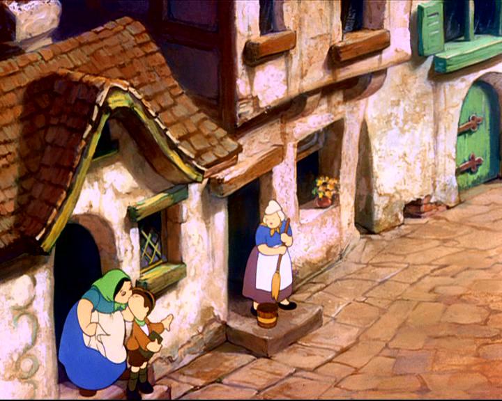
The figures in this image are just extras, no real effort has gone into their design, but we can see the increasing disparity between figures and environment in terms of detail, these characters don't seem to belong in these buildings. And this seems to be of some concern to T. Hee in his lecture. He didn't feel that the characters fit into their storyworlds anymore because of this aesthetic disparity. Perhaps as a result of this, we can see several techniques at work in Pinocchio that seem designed to try and bridge the gulf between character and background.
Pinocchio is obviously the story of a wooden boy that comes to life and wishes to become a real boy. The theme of animism, the idea of inanimate objects coming to life, lends itself very nicely to the animated medium. But more than this, the actual design of Gepetto's workshop where Pinocchio is born is designed to reflect the character's situation and to create a better 'fit' for the character.

This image is just one corner of Gepetto's workshop. He doesn't just make toys, he makes various mechanical objects, clocks, music boxes and so on. We can see the same kind of detail as the images from before, we can make out the grain of the wood, the play of light and shadows. It's the same level of detail but is designed to be far more 'cartoony' and broad. The images jump out at us a lot more. We can see a vibrant use of colours but also multiple little figures, creating a sense of densely packed activity. Although they're lifeless objects, they seem to convey a sense of dynamism.

This image is yet another corner of the workshop. Notice again the amount of small carven figures. Excluding Gepettto, Pinochio and Gepetto's pet cat and goldfish, there are no less than 309 faces in Gepettos workshop (yes – I counted them). Carved into clocks, toys, or in the furniture and beams, the entire environment is therefore imbued with life, reflecting Pinocchio's situation as an inanimate object brought to life thanks to the magic of both the Blue Fairy and the animated medium.

This moment from later in the film, where we have Lampwick in the process of changing into an ass, we have a different approach to easing the detail disparity. We can see the same kind of detail (shadows, textures, etc.), but the majority of the surrounding has been blacked out, the detail has been drained away in order to let us focus on the character. When Disney began to focus on characters and started making them more believable characters, this introduced something of a vicious circle. Because if you make the characters more believable, you have to make the world they live in more believable, but then the world becomes too believable and the characters no longer seem to fit anymore, and so attention needs to be drawn away from the detail in order to keep the focus on the character.


As Disney moved into the late 40s and 50s, the trend of realism died down and the approach to background art became quite different. In these (admittedly poor quality) images from Sleeping Beauty (Clyde Geronimi, 1959) we can see that there's clearly still detail, but the overall composition is a lot less geared toward realism, it has become a lot more angular drawing attention to its artifice in a way far closer to the Felix image than Pinocchio. There is a more of a simplified graphic aesthetic in both character and backgrounds and so they seem to mesh a lot more. Classical animation history has it that the reason for this stylistic shift was essentially the Second World War; revenue from Europe was cut off and when America entered the war the military requisitioned the studio for the production of training films. When the war ended, the studio simply couldn't afford to put the same effort into the artwork of its films. However, I think that certain elements of Hee's lecture and the strategies at play in Pinocchio, demonstrate that there was in fact a desire within the studio animators to go toward this more graphic style. Although money was certainly one very real factor, I think that perhaps the more significant one was the desire of the artists themselves to make believable characters that existed in appropriately rendered worlds.
The above piece is a rewritten version of a paper presented at the Cradled in Caricature symposium at the University of Kent back in 2011. If you so wish, you can listen to me deliver it over on the official site (http://cradledincaricature.com/events/cic-symposium-20-june-2011/) – bearing in mind that my notes consisted entirely of about 6 bullet points, so there’s an awful lot of the word ‘um…’ in it.