Tuesday, 31 December 2013

Depiction And Fiction: Virtual Wunderkammers

A ‘wunderkammer’ is a cabinet of curiosities, a collection of strange objects, or a group of mundane of objects whose grouping together creates a strange collection. The most renowned example is the extensive collection of Rudolph II who had cabinet after cabinet of more or less anything that one can think of. He was an obsessive collector and the modes of classification and distribution of items within the collection tell us a lot about how the royal collector organised his world-view. He was the patron of Acrimbaldo whose famous double-image portraits created human faces from aggregations of objects and animals. The paintings can themselves be seen as wunderkammers.


Animator Jan Svankmajer is greatly inspired by Rudolph’s collections, as well as those of naturalists and other people who try to organise the chaos of the world into human systems. His films often collect items together into seemingly arbitrary groups, in Alice (Svankmajer’s adaptation of Lewis Carroll’s book), the titular character’s fall down the rabbit hole is replaced by a slow descent in a lift, passing different floors as she goes; each floor a wunderkammer of various objects, from natural curios to Victorian toys.


In Historia Naturae, the different groups of the animal kingdom are explored in all of their varieties, while he even refers overtly to Acrimbaldo’s work in his heads made out of vegetables, kitchen utensils or stationary in Dimensions Of Dialogue.


A modern incarnation of Rudolph II is the eccentric Long Gone John, a sometime record producer, sometime art entrepreneur, sometime vinyl toy manufacturer and all-of-the-time collector. His unique life is explored in the documentary film The Treasures Of Long Gone John, which places its emphasis on two areas: his extensive collection of objects – ranging from mummified babies to 1960s Japanese toys – that now dominates his home to the point that he has moved out and converted it into a museum, and his relationship to a particular generation of artists associated with the underground art magazine Juxtapoz.


In fact, the film uses Long Gone John predominantly as a jumping off point to discuss the work of four artists in particular – Mark Ryden, Camille Rose Garcia, Todd Schorr and the arguable founder of the movement Robert (or Robt.) Williams. These artists are obsessed with the blurring of high and low/pop culture (the movement to which they belong is sometimes known as ‘low-brow art’, a term disliked by many of the artists themselves). They take influence from the ephemeral and popular; cartoons, comics, toys and corporate icons. Indeed, many of them have produced vinyl toys with Long Gone John’s company. They collect the pop culture objects that society forgets about, re-present them as artistically valid and then produce their own pop culture objects, to begin the cycle again.

Let us focus on two of these artists, Todd Schorr and Robt. Williams, whose paintings themselves are, like Acrimbaldo’s before, virtual wunderkammers of the camp and kitsch. Take, for instance, Schorr’s painting The Hunter Gatherer.


The elements of the ‘lowbrow’ movement can all be found in the image above; the fascination with the short-lived products of the fifties and sixties, the association between ancient idols and corporate ones, the implication that our reverence for both is somehow primal, and most importantly, the desire of human beings to collect these things. But rather than an analysis of what these paintings might ‘mean’, I want to focus on the multilayered ‘truth’ of imagery. In the previous two posts I have argued that depictions are both more conceptually complex and straightforwardly simple than photographic imagery. On one hand, depictions have a multitude of possible layers of interpretation as images, while on the other, when fiction is introduced, depictions can offer us a diegetic object or character that is more ‘true’ than a prop or actor.

Sticking with Schorr’s painting, what we have is not only a depiction of a proto-human, but depictions of a variety of art-objects (loosely; the artistic merit of such toys might be debatable for some, but I will continue with it as shorthand – I’ll define an art-object as any article that can be evaluated on some deeper level than just the descriptive). These art-objects are different from the being that collects them. While the central figure exists only as a depiction, the toys are depictions of things. The Adam West Batman toy, the Howdy Doody puppet, the robot, are all paintings of objects that actually exist (the other toys – Betty Boop and Mickey Mouse – are not so simple). As images, these toys are themselves depictions; a toy of Batman is not the actual character but a three-dimensional depiction of the character. While the robot remains fairly consistently itself, the toys of the already established cartoon characters become more complicated – they are depictions of depictions of characters.


Another Schorr painting, Variations On Kitsch, gives us a similar premise – a collector and his collection. But now the objects in the collection seem to possess more of a life of their own. While in The Hunter Gatherer, only Mickey and the Idol moved, here all of the kitsch objects seem to be bouncing around the space, perhaps dancing to the beat of the beatnik’s bongos. On top of this, though they possess intentional nods to existing objects, the art-objects here exist entirely as depictions. Though the astronaut caveman in the corner is clearly designed to remind us of Fred Flintstone, he isn’t that character, nor even a toy of that character, he remains a completely unique object that exists only within the painting. The relationship between the depicted art-objects to the real world distinguishes the two paintings; the emphasis on the former being the depiction of real toys (themselves depictions of characters), while the latter is depictions of entirely ‘diegetic’ art-objects. While we can evaluate the hunter gatherer’s collection on two levels, as objects with their own pop cultural baggage or as depictions of those objects by Schorr, how do we evaluate the art-objects of Variations On Kitsch? As components of an overall composition, or as virtual art-objects?

Such considerations will be the focus of future posts, but for now let us stick with the idea of these paintings as collections of virtual art-objects. Moving on to Robt. Williams, two paintings offer up similar collections for our multi-layered perusal. The first gives us an image with similar levels of visual interpretation as The Hunter Gatherer, a vast collection of art-objects that are depictions of real ones. Wooden Spirits Persist Where Termites Fear To Tread  presents us with another collection that exists as a single depiction.


On the other hand, In The Land Of Retinal Delights might, as a painting, appear to be less interesting at first glance; the vast collection of objects presented to us do not have the same multiplicity of possible diegetic truth layers as Schorr’s do.


But what Williams’ painting lacks in diegetic complexity it makes up for in sheer scale. The entire landscape in which the figure stands is made up of these strange apparently plastic kitsch objects. At first glance they might appear to be toys, the kind of cheap plastic ones that you get in Christmas crackers; one appears to be a red spinning top, another a green facsimile of a lunar landing pod. But these are only superficial similarities of shape. In fact, these objects are entirely surreal and virtual, depictions of themselves, not of anything we might find in the real world. But each of these objects is rendered in minute detail, each given a solid distinctness which continues as far back as we can make out. Only the furthest peaks of the distant hills reduce the objects down to coloured dots. This is a collection of the imagination, a multitude of virtual art-objects that we can only see through the medium of this painting. Williams invites us to delve into his collection just as Long Gone John does at his home-cum-museum, but while Long Gone John’s objects are real and we can view them by walking through the space that holds them, Williams’ collection is one we can only appreciate via the depiction.

And this is where these paintings have a particular resonance and relevance to a collector like Long Gone John – as his own collection of real art-objects contains many of these Juxtapoz paintings, themselves containing a variety of virtual art-objects, his collection becomes augmented, a collection of real objects, depictions of real objects and depictions of entirely virtual objects.


One more Schorr painting, The Pirate’s Treasure Dream, was created specifically for Long Gone John (he’s the pirate king on the altar on the left); the image depicts some of the various objects of his collection as prisoners taken by the monstrous pirate band. Marching along in chains, the prisoners are taken a step further from those in Variations On Kitsch; they have become sentient characters like their collector. They add yet another layer to the complex imagery – they are depictions of characters that are toy depictions of characters. That gives us four possible ways of looking at some of these figures. One figure in particular is fascinating; the bunnyduck, held aloft in the tentacle of the pirate octopus.


The complexity of this figure lays in its history: the character appears in two earlier Schorr paintings Romantic Notions Of The Mysterious East and The Spectre Of Cartoon Appeal. In these paintings, he is a character, an amalgam of Bugs Bunny and Daffy Duck, existing as a diegetic entity within the world of the paintings.


But the character was also produced as a vinyl figure in the real world. And in The Pirate’s Treasure Dream, we are given not the character itself but a depiction of a toy of a depiction of a character that is an allusion to other characters (Bugs and Daffy, themselves only existent as depictions).

These paintings, and others like them, are so complex in their multilayered depictions that they instantly set up a multitude of possible visual interpretations and modes of evaluation. Depicting virtual collections of art-objects both real and imagined, the painting becomes a double itself; it is both an art-object in its own right which can be appreciated as a single composition, but we can also look through the depiction at the art-objects being depicted and evaluate not one art-object but many – the paintings become virtual wunderkammers.

                                                                                                             - P.S.

Friday, 13 December 2013

Depiction And Fiction: Animated 'Truth'

A TALE OF TWO VASES

In the previous post on the subject of ‘Depiction & Fiction’, I argued that animated imagery was more complex than live-action imagery because it contained multiple layers of fiction (that the image from Labyrinth Labyrinthos was a depiction of a fictional toy that was itself a depiction of a fictional entity of the Toonerville Trolley, itself a depiction of the diegetic trolley). In this post, however, I’m going to argue the opposite, claiming that the imagery of hand-drawn animation is conceptually simpler, that it offers us a more direct depiction of diegetic information than live-action does, that it is in some ways 'truer'. To this end, let us leap straight into our titular hypothetical example, the comparison between a vase in a live-action film, and a vase in an animated one.

In live-action, we see a recording of a solid object that exists in front of the camera, the imagery that we see is a photographic ‘trace’ of the object and – as was mentioned in the previous post – would therefore appear to be a more straightforward image than a depiction. We look through the mediation of the recording process and see a true reproduction of the object that was recorded. When the director places the vase in front of the camera and shouts ‘action!’ in our hypothetical example, it allows us to see the vase more or less as we understand it to be in the real world. This is one of the central appeals of live-action cinema, from the earliest Lumiere brothers’ actualities, to critic Andre Bazin’s insistence that realism defined the cinematic medium from other art-forms, to the enduring fascination with documentaries and reality TV.

But when we consider the way in which fiction films operate, this becomes a more complex phenomenon. When we see the object in front of the camera, it is tied to the understanding that what we are seeing – most of the time – is an object purporting to be something else. In this case, what we are seeing is a prop purporting to be a vase. Within the fiction, the vase is an expensive and irreplaceable object, while outside of the diegesis, the prop of the vase is simply a plastic facsimile. As such, the live-action image takes on a dual status thanks to fiction – both real prop and fictional vase - and complicates the idea of the truth of the object. The prop, essentially, lies about being a vase.

With animation, as one might expect, this phenomenon is quite different. When we look at the vase in our hypothetical animated example, we do not have this same kind of doubling-up. The drawn vase is simply a direct depiction of the diegetic vase, there is no additional pro-filmic layer as there is in the live-action example. The fictional vase is all that there is, devoid of the additional layer of extra-diegetic prop. This might seem to be completely at odds with the claim of the previous post, where I argued that the animated image has multiple levels of understanding (the depiction and what is being depicted). Why is this phenomenon any different to our example of the pro-filmic prop? Simply, one is about complexity on the level of image, the other is about complexity on the level of fiction, our understanding of what we are supposed to be looking at.

While the Toonerville Trolley toy had, I believe, four different layers of potential understanding attached to it (the depiction of the toy, the diegetic toy, the cartoon object that the toy depicts, and the diegetic trolley that the cartoon depicts), all of these options were based upon decisions that the viewer made regarding their comprehension of the image. As an image, it could be all of these things simultaneously. As far as the level of fiction goes, the situation is far simpler – it is a direct depiction of a diegetic toy, not a prop purporting to be a toy as we have with our live-action vase.

Our hypothetical animated vase therefore is only the vase of the story, without the additional layer of pro-filmic understanding. This becomes more interesting when we move away from inanimate objects and look at characters. When we see a character in a live-action film, we are likewise able to look at the figure on screen in one of two ways – as pro-filmic performer or diegetic character. When we see Charlie Chaplin, we can either choose to perceive him as Charles Chaplin, the Hollywood writer, director and performer, who cavorts about the screen engaging in a variety of impressive slapstick set-pieces, or we can choose to see him as the Little Tramp, the hopeless, homeless man who finds himself in a variety of scrapes and scenarios that he has no control over.

But with an animated character like Felix the Cat, we do not have a pro-filmic performer to consider. We can only see the diegetic character of Felix, without the additional consideration of a performer. As such, I would argue that animated characters are more 'true' than their live-action counterparts because they lack this extra level of non-diegetic complexity. Michael Corleone in The Godfather (Francis Ford Coppola, 1972) can never sever himself from Al Pacino; the pro-filmic actor will always be hovering around our perception of the character, always potentially distracting us from Corleone as a complete and truly diegetic entity. But Bugs Bunny is capable of being just Bugs devoid of any non-diegetic complexity. The things that Bugs says and does are therefore, in a sense, more true than the words and actions of Corleone.

                                                                                                                  - P. S.

Monday, 28 October 2013

Depiction And Fiction

I find animated imagery fascinating. It is not simply the characters, stories, visual compositions or stylistic tropes that draw me to animation; there is something in the fundamental nature of the animated image as a depiction that – for me at least – opens up a variety of possible interpretations, or readings of the image, in otherwise fairly straightforward narrative moments. I have briefly mentioned in a previous post the idea of ‘depiction and fiction’, the multitude of interpretative layers that are introduced by the relationship between the animated imagery and the fictional worlds and objects that the imagery creates for us. These thoughts are really just an indulgence in this fascination, rather than an argument about medium specificity or the superiority of such images over more standard ones.

What does the phrase ‘depiction and fiction’ refer to? Put simply, when we look at a recorded image of something (whether recorded photographically or digitally) we see a trace of the original object, but when we look at a rendered depiction of something – that is, an image that has been created through a combination of shape and colour to resemble something that we can identify – then this image has a dual status. The image we see is both a depiction and the thing being depicted. We have the option of either looking at the image (seeing Simba from The Lion King as a drawing) or looking through it (seeing Simba as a diegetic lion). Although the notion of ‘trace’ and the apparently unmediated nature of the live-action recoded image is, quite rightly, viewed with some suspicion by many scholars, my focus here is predominantly with the created imagery of traditional animation and thus I will just be conceptualising the live-action image as a recorded trace for the sake of ease. If one wishes to argue that a live-action image is also doubled (both ‘Cary Grant’ and a ‘flat projection of a recording of Cary Grant’ simultaneously) then all this means is that the animated image becomes equivalently trebled (the character ‘Simba’, the ‘hand-drawn depiction of Simba’, and the ‘projection of the recorded image of the drawing of Simba’). For simplicity, I shall therefore continue to consider the live-action image more ‘transparent’ than the animated one.
I intend to return to this idea of depiction and fiction in future posts, exploring the implications that it has for narrative comprehension, diegetic integrity and the ‘truth’ of the animated image. But for now, to lay the groundwork, I shall briefly demonstrate what I mean when I talk about multi-layered nature of the animated image when considering the relationship between the depiction and the fiction that it depicts. Let us consider the following image:


Here we have a fairly straightforward image from a Hollywood Golden Age short – The Toonerville Trolley from 1936 by Van Beuren Studios. We can see the image in one of two ways – as a flat depiction or as the diegetic space, objects and characters that have been depicted. Our understanding and acceptance of animation is so ingrained in our civilisation that we do not look at the image and struggle to comprehend it. We can happily make out a countryside environment, a train track, a trolley running along the track (though our understanding of the trolley might be dependent on our historical knowledge of the almost totally defunct form of transportation), and the Skipper riding the trolley. The degree of caricature, of simplification and exaggeration, contained in the image does not confuse us. Although we have never encountered a man who looks exactly like the Skipper in our real lives (with those exact proportions or textures), we have a good enough grasp of animation convention to successfully look through the depiction and see a man driving a trolley along a track in the countryside. Yet simultaneously, we are also able to see nothing but the caricature, looking at the image and its overt differences from what we understand it to be depicting.


This next image is, of course, a photographic record of a toy. But let us for the moment ignore the photograph and focus on the toy itself. The toy, as a hand-made object designed to convey an impression of something rather than being the thing itself, is also mode of depiction. But here the levels of fiction contained within the depiction have increased. It is on one level a toy and we can appreciate it as a three-dimensional object. At the same time we can look through the toy and see the same trolley and Skipper within. But there is another layer of fiction in-between these two, which is the possibility of looking through the depiction of the toy and seeing the animated image. The object can therefore be the diegetic trolley and driver, the animated depiction of the trolley and driver, and the hand-made toy of the animated depiction of the trolley and driver. As an object, it has a three-fold existence depending on how we choose to appreciate it, what we choose to see (and therefore the actual photograph of the toy that you’re looking at now has a four-fold existence). Just the toy itself, as both an object and a double-depiction, has enough visual complexity to keep me happy for hours, even though it appears to be a fairly unremarkable object.


But we are not done yet. This next image is from Labyrinth Labyrinthos, a segment directed by Rintaro from the 1987 anthology film Neo Tokyo. In this array of tin toys that are suddenly brought to life we can make out some generic tin toys (the tortoise), some thinly-veiled analogues (the not-quite-Mickey Mouse) and, in the centre of the shot, the Toonerville Trolley toy. As one can predict, we now have further layers of appreciation and understanding at work in this image. It is a hand-drawn animated depiction and we can appreciate it on this level. We can look at the detail of it, the ways in which light and shadow are used to create a greater sense of depth and texture than we find in the first image. Although a single image doesn’t allow us to, we can also conceivably appreciate the movement of the depiction as it makes its way across the screen. But we can also appreciate it as a toy, looking at both its form and movement in the same way that we would the actual tin object. And because of the ‘actual’ nature of the toy (it refers to a real toy in our world that we could possess) it also contains the layer of fiction of the original animated image. It is a drawing of a toy of a drawing of a diegetic trolley; a depiction, of a depiction, of a depiction of a thing. Although on-screen for all of five seconds, the Toonerville Trolley toy in Labyrinth Labyrinthos serves as a reminder of the inherent complexities of the hand-drawn imagery of animation. The multiple layers of possible interpretation are unavoidable.

The simultaneity of the animated image, that it is one, or two, or three, or more things all at once, is one of the principal fascinations of animation (and the visual arts) for me as an individual. Just as with Satoshi Kon’s use of depiction and fiction to play elaborate visual games with flat surfaces and depicted spaces, all animated characters, objects and environments are able to contain multiple diegetic layers, each one potentially a web of meta-fictional references.

                                                                                                             - P.S.

Friday, 27 September 2013

Essay Advice For Undergraduates


This advice is aimed at students just beginning their undergraduate degrees in Film Studies. Though many of the points might seem rather obvious, these have been the most common issues that I’ve come across having marked many undergrad essays over the last few years. The advice is designed purely as that; this is in no way a guaranteed recipe for academic success, but rather a few comments based upon the recurring problems I see in the work I mark, and more or less how I approached this kind of work when I was an undergrad (and, all things considered, I did alright). I'm going to use an example essay question entitled ‘Describe Some Of The Functions Of Editing In The Films Of Jan Svankmajer’. I’ve done this in the hope that there isn’t a real essay question out there that I'm going to be giving answers away to. If you don’t know who Jan Svankmajer is, don’t worry, I'm only going to refer to this fictional essay question as demonstration.

Structuring

Let’s assume you have an essay of 2500 words. My personal advice is to be simplistic and anal about breaking it down into even chunks. Let’s say 500 words can form both your introduction and conclusion (in themselves, they are basically summaries that read along the lines of ‘this is what I'm going to look at and why it’s important’ and ‘this is what I have looked at, and it proves my point nicely’). This leaves you 2000 words to break down into 4 points. Some essay word counts will be shorter, some will be longer – but the key here is to try and divide the essay into a few points (generally 3 to 5 is enough) of more or less equal length. You don’t need to be so rigid when you actually write it –some points will warrant more words, others less. It’s a guide to make sure you don’t fall too short of the word count or go massively over. I can assure you in no uncertain terms that, even if you say you’ve written the correct word count, we can tell by looking if it’s not (we have some 30 other essays on our desk that we can compare yours with, after all).

Try to think about each of your points as a sub-question and take 500 words to try and answer it. This way, all your points have a purpose in the overall argument. In our Svankmajer example, for instance, we could structure it in one of two ways; either by looking at four films and discussing the editing in each, or by looking at different approaches to editing exploring how his films fit into these categories. I'm going to go with the latter. So my first section will look at continuity editing, perhaps asking something along the lines of ‘does Svankmajer use much continuity editing in his films, and if so, to what end?’ The sub-questions don’t need to be ground-breaking, they’re purely for you to help you focus your attention; you won’t keep them in the text of the finished essay. So, I will then identify moments of continuity editing in his films and discuss the relevance – for instance, Picnic With Weissman uses establishing shots in order to link the otherwise disparate events going on. This creates a sense of unity between the different areas of action even though they rarely overlap with each other directly. I might then look at the possible influence of Soviet Montage on the films’ editing (Svanmajer made films in Communist Czechoslovakia so the influence is quite probable). I can then discuss moments when two images are edited together to create particular mental association that are unrelated to the spatio-temporal unity of continuity editing. I might then talk about the rhythm of Svankmajer’s editing, its relationship to the music score, or maybe the fact that as stop-motion animation, his films are edited on a micro-level of the frame-by-frame process. The actual specifics are unimportant. What is important is that each point builds upon the last, that I don’t simply repeat myself as I work through these different editing modes.

Description And Analysis

Undergraduate essays have a tendency to conflate these two concepts and it is important that you understand the difference between the two - and what their relationship is. Description is a necessary part of the process; you always need to be sure that whoever is reading the piece knows what specific sequence you are looking at. But description is only the ground floor. You describe all of the pertinent details that you need to in order to make sure that the reader is on the same page as you, but then you move on to analysing them. Your description of the framing of a sequence should be in service of analysing the purpose and function of the framing in the particular sequence (who’s in the frame, who isn’t, how does this steer our understanding of the shot?). But likewise, analysis doesn’t work without description. Many an essay has been written that leaps straight into analysis without providing any kind of context – the person marking the essay will most likely have seen the film you’re writing about, but they won’t know what moment you’re discussing unless you tell them.

Incorporating Other Peoples’ Work

First year degree students tend to slip into two camps when it comes to using references; either, you quickly find a bunch of quotes that agree with what you’re saying and stick them in, or, you intentionally set out to disprove or disagree with an existing position. While both of these approaches are perfectly valid in terms of the overall academic practice of essay/article writing, it’s not the best way to start out with your first few essays. The former approach can look simplistic and give the impression that all you’ve done is scour books for quotes, rather than actually reading anything. The latter is unadvised on the basis that, as an undergrad, you’re highly unlikely to be able to mount a particularly convincing argument – you end up looking arrogant if you criticise a well respected academic with a poorly conceived criticism. The best approach is to summarise and incorporate: read an article or chapter, make sure you’ve understood the position and argument of the piece, then put forward that argument in a succinct paragraph. This paragraph then becomes a linking point in your overall argument. For instance, we can look in the Peter Hames edited collection Dark Alchemy: The Films Of Jan Svankmajer and read articles by Michael O'Pray and Roger Cardinal. Summarise the gist of what each author is claiming and spend no more than a couple of sentences on each. Do they agree or disagree with each other in any significant way? Where does your own claim sit in relation to their ideas? The point here is to demonstrate that you get what they're saying, but don't spend any more time on them than necessary. The fear for most students is that this approach will get them in trouble with plagiarism. As long as you make it quite clear which ideas are yours and which ideas are taken from another source, then you shouldn’t have any problems.

An Essay Is Not A Review

Though it might pain many of you to accept it, the fact is that we really don’t care much about your opinion of a film. Unless the question is very specifically asking you to evaluate a film (which is rare), you should always avoid telling us what you personally thought about it. There are a great many platforms from which to voice your personal opinion about a film; from blogs, message boards, youtube videos, or just ranting with your mates down the pub. An academic essay, however, is not the place for it. Of course, the way you personally perceive a film will affect the way you approach the particular question, a certain degree of subjectivity is unavoidable. But what you need to make sure to avoid is the attitude of ‘I loved it, so it must be good’, or the more common and infinitely worse ‘I hated it, so it must be bad’.

What makes a film student different from a film fan or film critic is that you need to have a wide and varied appreciation of all modes of film; outside of your own comfort zone of the films you happen to enjoy watching. For many film students, this is the major learning curve of the degree. You are not being asked to evaluate a film, you are being asked to identify certain pertinent details about a film, extract them and interrogate them in order to enhance our understanding of the film. Indeed, you (or your parents, or the government on the understanding that you’ll pay them back) are paying a huge amount of money to come to University and study film; there’s precious little benefit in just coming and doing exactly what you’d do coming out of the cinema on a Saturday night. You can hate Citizen Kane with the fiery passion of Hell, which is perfectly fine from the point of view that every person is free to their personal preference. But a film like Citizen Kane doesn’t achieve its status by accident. People didn’t sit around a table, randomly pulling film titles out of a hat in order to decide which are the most important cinematic works. Even though you might hate it, as a film student, you need to be able to identify the film’s achievements – if you can’t see them, you’re probably taking the wrong degree.

Finally, it is important to always be clear on what the essay question is asking you to do. Our example here is a pretty straightforward and open one, but other questions can be quite specific in what they're after. If the question is 'How is Psycho a prime example of Classical Hollywood Storytelling?' don't spend your time talking about Hitchcock's other films or the avant garde film movement of the 1920s. Demonstrate your knowledge of Psycho and the narrative devices of the Classical Hollywood period. It might seem painfully obvious, but there are always students that just don't seem to pay any attention to what is being asked of them. Don't be one of them!

                                                                                                                                     - P. S.

Saturday, 24 August 2013

Surfaces And Spaces: In Commemoration Of Satoshi Kon

Today marks the third anniversary of the death of director Satoshi Kon on what would have been his 50th year. In honour of this fact, this post will briefly discuss the tragedy of his death, and the ways in which Kon as a director explored the animated medium in both ingenious and multifaceted ways.

Kon’s death was tragic on many levels; dying at such a young age would be awful enough, irrelevant of his artistic abilities, but the fact that he was never able to reach his full potential as a filmmaker is perhaps more tragic to the world at large. I fully believe that had he lived he would have become one of the most significant figures in animation. The word ‘genius’ tends to be excessively used these days, but I honestly believe that, if Kon wasn’t a genius, then he certainly would have developed into one. His films often explored the conventions and philosophies of live-action film but did so through a unique approach to animation. He made films that on first glance were essentially ‘live-action films that were drawn’, replicating real life filming techniques, treating characters as if they were solid actors existing in a real pro-filmic space. Yet just below the surface, it was apparent that Kon was really exploring the possibilities of the animated image; replicating live-action only helped to emphasise just how utterly different the animated film is to the live-action one. But these films were not simply academic exercises in the possibilities of animation to explore perception – they remained engaging character-driven narratives, rarely slipping into the realms of artistic self-indulgence. Both Tokyo Godfathers and Millennium Actress are heartfelt stories about characters dealing in different ways with their past actions. The focus on both of these films is the emotional landscape of the characters, their relationships and their memories. But this exploration utilises the animated form completely, doubling and fracturing the characters in order to explore their identities. Past, present, dream, reality, individual personality and collective unconscious all become undifferentiated in Kon’s stories, which are always more complex than they appear on first viewing.

Another tragedy of Kon’s death is that his final film, The Dreaming Machines, will probably remain unfinished. Though animation studio Madhouse announced their intentions to continue production after his death, the film seems to have fallen by the wayside, a victim of financial and creative issues. But most tragically of all, for me at least, is the fact that Kon seems destined to be remembered for his two weakest films. When news of his death first broke, the comments left up on websites message boards over the internet reiterated more or less the same general sentiment: ‘I wasn’t really fond of Perfect Blue or Paprika but he clearly had the talent to grow as an artist’. I don’t wish to paint either of these films as ‘weak’ in any objective sense, as I think that they’re both very good in that they achieve by and large precisely what they set out to achieve (indeed, each time I watch Perfect Blue I’m struck by just how well directed it is – the film’s biggest flaw is its ending… but that critique will have to wait for another post). But neither one is as complex or rewarding as Tokyo Godfathers, Millennium Actress or the best episodes of the television series Paranoia Agent. Although there is a tendency among the ‘experts’ to place more emphasis on these less well-known films (several academic books and journals have analysed Millennium Actress as Kon’s ‘magnum opus’ because… well, it is), the general public will probably always remember him for his two most obviously ‘genre’ films. If, after his death, Hayao Miyazaki were to end up being remembered for Kiki’s Delivery Service – perfectly good film though it is – we would think that his memory was being severely sold short. The same is the case with Kon.

But to demonstrate that I do still think his brilliance is at work even in these two more ‘obvious’ films, I will now present a very brief analysis of the complexities of image that are apparent in the opening credit sequence of Paprika, his final finished film. Much like any Kon film, on the surface the animation appears to be a straightforward replication of live-action filmmaking aesthetics. The opening five-minute sequence has two characters traverse through a variety of overtly cinematic scenarios – homages to spy movies, screwball comedies and Tarzan all bleed into one another – playing like a love-letter to classic era Hollywood. But as the opening credit sequence itself begins, we can see Kon’s more significant concern – the possibilities of the animated image in comparison to the live-action one – come to the fore. In a live-action film, we see a real three-dimensional space that has been recorded and projected on to a flat surface. But with the hand-drawn animated film, we see a depiction of space – a flat surface that only gives the impression of depth. This fundamental difference between the two is Kon’s central conceit throughout the sequence.


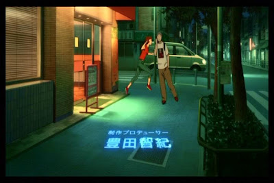
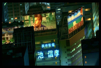
To begin, there is an immediately blurring between the diegetic space of the fictional world and the extra-diegetic information of the credits. Placing the credits within the story-world is an idea that Kon uses in Tokyo Godfathers and each of the episodes of Paranoia Agent, and here the names of the various people involved in the production of the film are ‘projected’ into the world of that film. This gives the impression that the surface of the image is actually a space through which this light can traverse and contains solid objects that this projected light can hit. As can be seen in the images above, the words are themselves presented as if they are warped by uneven surfaces, emphasising the impression of space and depth within the surface of the image. This is of course an illusion, as the faces, vehicles and buildings are all themselves flat depictions and the projected words are equally flat. But the combination of the two draws attention to this illusory nature of the animated image.


When Paprika, the titular character riding the scooter, passes in front of a painted image on the side of a truck, she suddenly becomes that image, which comes to life and she blasts off of the surface into the space above the cityscape. Again, what we have in reality is one single flat surface, carefully crafted to create the impression of different layers of spaces and surfaces. This in itself is common enough in animated films. But it is Paprika’s own movement across these layers that highlights their multifaceted nature. The image on the truck is not simply a depiction on a flat surface, but a flat depiction of a three-dimensional space containing a flat surface which depicts a rocket which takes off into another flat surface depicting a three-dimensional space.


Immediately following this we are presented another movement that creates complex relationships between depicted surfaces and spaces. Paprika appears as a character on a billboard on top of a skyscraper. She is depicted standing behind a man but then decides to get up and move in to the adjoining billboard advertising beer on a beach. She moves into the new space, turns, reaches and picks up the glass and moves off out of sight. The fact that the shot is composed in the way that it is, looking down from a high angle, and the fact that the two buildings are not aligned emphasises the games of spatial perception that Kon is playing. We have a flat surface depicting a space containing two buildings, the angle of which creates an even greater sense of depth. But on top of each building are flat surfaces which depict two other spaces. By moving across, Paprika unites the two disparate flat depictions into a new continuous three-dimensional space. The billboards become windows through which we can look into this illusory-space-within-illusory-space (mirroring the way in which the cinema screen appears to be a window into a fully-realised diegetic world).


In the next sequence, Paprika moves from the surface of a computer screen in to the room containing the computer. The movement is on one level a simple shift from flat surface to three-dimensional space, but it also, like the billboards, creates a new space out of a surface. She is behind the screen, but at the same time she is in front of the information being displayed on the screen, creating a gulf between the two layers wherein she can exist. More importantly, because of the smooth continuity of her movement, the office space behind the partition from which she emerges becomes collapsed into this virtual space. Initially we have a single surface depicting an office space, within which there are other flat surfaces, the partition and in front of that the computer screen. But Paprika’s brief movement transforms the image into a depiction of a virtual space containing a virtual layer. The flat surfaces of the computer screen and partition become a single layer in front of Paprika, while the visual information on the computer and the office become an expansive space behind her. In live-action, where the space would be real and not depicted and a surface could not be a space simultaneously, such visual complexity would be difficult, if not impossible, to pull off.


Next, Paprika emphasises the three-dimensional space by de-emphasising herself as a flat surface. Like the film’s credits, she is projected into the world from somewhere else. As she skips down the hallway, unseen by the security guard walking in the opposite direction, we can see that she is not a solid object within that depicted space, but rather a flat projection that warps as it moves along the different surfaces of the hallway. She is not a flat image moving across a surface (as she is on the side of the truck), or a solid figure moving through a surface depiction as if it were space (as she does on the billboards), she is a flat image moving through a three-dimensional space. Or, at least, she is if we view the hallway as a space rather than a surface depiction of space. Paprika’s own flatness and the fact that she seems to move through the hallway-as-a-space rather than over the hallway-as-a-depiction emphasises multitude of possible ways of reading the animated image. At the very end of the shot, she is momentarily projected over the guard, at once emphasising his solidity and existence within a space but also reminding us of the flatness of the surface image.


Toward the end of the credits sequence, Paprika escapes from the unwanted amorous attention of a couple of young men by jumping behind another man on rollerskates. The man skates towards the camera and we see Paprika is now an image on his shirt. As he rides into the camera, the depicted space on his shirt becomes a three-dimensional space for Paprika. Or, more accurately, the surface that depicts the space of the street contains within it the depicted surface of the shirt image which then becomes a surface depicting a new space(!). Like the computer screen in the office earlier, the space surrounding the surface of the shirt and the space depicted on the surface of the shirt become collapsed into a single continuous space for Paprika. But while in the office sequence the computer screen could almost be seen as a window allowing us to see through the partition into the space behind, here the notion of ‘in front’ and ‘behind’ are rendered void. If we view the surface of the shirt as a window through which we can see the space beyond, this means that the space Paprika is in is behind the space of the street. The image on the shirt therefore would be not only a window through the surface of the shirt but also through the space of the street. So, if she starts out in the space of the street and jumps behind the man, how could Paprika end up behind the street? We are, of course, not meant to think these sorts of questions of spatial continuity as we watch – but I would like to think that this interrogation of the animated image, as a depiction of space rather than as actual space, is more than simply over-thinking on my part. These kinds of visual games are at play in numerous animated films. Just think of Wile E. Coyote painting a tunnel on to a brick wall, only for the Roadrunner to run into the depicted tunnel, transforming the surface into a space.

At the very last moment before the man on skates runs into the screen, Paprika jumps to get from one image (on the shirt) to the next (in the street). Her arms extend beyond the frame of the shirt’s image, making it look as if she has jumped out of the shirt. In fact, she has jumped from the depicted street on the surface of the shirt into the space of the street depicted on the surface image of the film. For Paprika as a character, much like the Roadrunner, the distinction between surface depiction and depicted space becomes redundant. She behaves as if she knows that space is just a flat depiction on a surface and therefore all surfaces within that depiction are fair game to treat as space. What I have analysed here constitutes a brief three-minute opening sequence that plays with the differences between the depiction (the surface image) and the fiction that it depicts (the space of the story world). These complexities exist almost entirely on the level of image here. The rest of the film – not to mention Kon’s other works in general – plays with this interplay in even more complicated ways, where characterisation and narrative events are intertwined with this manipulation of image layers, where real and unreal, dream and memory, depiction and fiction become inexorably bound up within the same concept.


And that is one of the reasons why Satoshi Kon will be sorely missed.

                                                                                                                                   - P. S.